
Summary & Timeline
It’s now been about a month since I self-published my fantasy adventure novel, Into the Gloamwood. I’ve already discussed aspects of writing the manuscript, illustrating the cover, and the like in other blog posts, but now that it’s out in the world and some time has passed, I wanted to compile a holistic retrospective of all the effort that went into making this book exist.
Here’s the overarching timeline:
- 2019: Wrote first draft of Into the Gloamwood (then called Into the Darkwood).
- 2020-2021: Initial beta readers and revisions: positive feedback, minor edits
- 2021-2023: Queried literary agents. 50 queries. One full manuscript request. Zero offers. During this process, updated letter, synopsis, and which sample pages to include based on feedback from friends in the industry.
- 2024: Paused querying and acquired more beta reader feedback. Axed prologue, revised first chapter. Sketched cover art.
- Early 2025: Tried one more small batch of agent queries. No bites.
- 2025: Acquired more beta reader feedback. Revised beginning again. Resolved to self-publish. Continued work on cover art.
- 2025, October-December: Wide beta reading round, penultimate revisions, working title change to Gloamwood.
- 2026, January: Full read-through and finished penultimate revisions.
- 2026, February-March: Prepared files for publication. E-book accessibility edits, front and back matter preparation, setup on distribution platforms, etc. Made available for preorder. One last, full read-through and polishing pass for tiny details.
- 2026, end of March: Self-published and told friends!
This timeline spans the beginning of 2019 to early 2026. That’s seven years. Seven years of writing, revising, collecting reader feedback, poking, polishing, querying, and learning about publishing options. Goodness, that’s a long time. Mind you, I balanced this novel with working a full-time job, practicing aikido, completing a part-time engineering master’s program (from 2018 to 2024), and writing other novel drafts and short stories, so it didn’t consume seven years of my life. But it was a part of it, a work in progress, for seven years. And it’s finally complete.
The rest of this post is long enough to warrant a table of contents or something. Jeez. Well, I’ll provide an outline here, and you can jump around and skim if you want:
- Writing the Book
- Initial Draft
- First Feedback and Revisions
- Axing the Prologue
- Revising the First Chapter
- …And Revising Again
- Penultimate Revisions
- Polishing Finale
- On Writing: Closing Thoughts
- Cover Art
- Publishing
- Why Self-Publishing
- Options, Cost, & My Approach
- About ISBNs
- Paperback Formatting
- Paperback Cover
- E-book Formatting & Accessibility
- Distribution Options
- Economics: Retailers vs Aggregators
- Economics: Print vs E-book
- My Distributor Choices
- Amazon KDP
- Draft2Digital
- Lulu
- Summary
- On Publishing: Closing Thoughts
- Reception & Reflection
- Resources
Writing the Book
Forget publishing, just writing and editing the book was a saga. (As is proper and desirable. I do want to spend more time writing and enjoying making art than dealing with other logistics.)
Initial Draft
I started writing the first draft for Gloamwood in 2019. But the idea for the premise was, perhaps, born in a short story I wrote for my introduction to fiction class in 2014—a tale about a desperate teenager who ventures into the forest to find a cure for his ailing parent. The story has more parallels with my novel, but I’m trying to avoid spoilers.
In 2018, a different novel draft of mine was just not working. It was meandering, bogged down, lacking in joy. I wanted a story that would be straightforward to write and fun to escape into, and a quest with a clear, location-based goal and a reason to keep the characters moving inherently provides the structure for such a tale. So this old idea bubbled to the surface; I put together a rough, simple outline for the novel; and over the course of a year, I wrote it from beginning to end.
This first draft included a prologue that would eventually be axed, and the first chapter would see substantial revision. Details would need editing, and a few scenes would need adjustments and expansions. But the story poured out structurally sound and mostly well paced, past the first bit, and its emotional core, characters, plot, and most of the initial prose carried through revisions and into the published version.
This does not always happen! I can easily wind up writing a partial or entire novel draft, then either burying it or rewriting it so heavily that it’s more of a reincarnation than a revision. It probably helped that in a sense, this was a reincarnation of a short story that already had a piece of the premise and emotional core embedded in it. The straightforward plot structure also helped.
First Feedback And Revisions
After I completed the first draft, I requested feedback from my first beta readers: my sister, who has an eye for detail and whose taste I trust and often share, and a friend who’s an avid reader and who kindly offered when I mentioned my novel.
From what I remember, both of them caught a smattering of details: typos, a few cases of phrasing that needed adjusting, inconsistent pronoun use for one or two characters, and the need for a clearer, more gentle introduction of a cross-out mechanic I’d used in a few places for stifled thoughts. (This mechanic didn’t make it into the published version.)
They also both said they enjoyed it and accused me of keeping them up late with cliffhanger chapter endings. My friend said she was surprised by how polished it was; she’d expected a first draft to be rougher, to need more work. She also liked the prologue, which is probably why I didn’t axe it for so long.
So, yeah! It’s one thing if friends are trying to be kind and gentle with their words, and that needs to be recognized and taken into account when considering their feedback. It’s quite another, I think, if they bluntly say it was better than they expected and are blaming your story for lack of sleep.
So I made minor polishing edits, ran those edits by them, and started looking into the traditional publishing process. I also started writing another novel draft: a reincarnation of the one that hadn’t worked, one for which I’d finally found the spark of fun and light and the emotional core that had been missing.
Axing the Prologue
I won’t get into the details of querying agents, since it didn’t work out. But after trying for a while and getting no offers, I attended a literary conference that one of my friends organized and booked an appointment with an agent for review and feedback on my synopsis, query letter, and sample pages.
The synopsis looked solid, but benefitted from a few tweaks such as putting character names in all-capitals as they were introduced. The query letter needed shortening, and they had suggestions to help trim it. After reading the sample pages from the prologue, they advised that the first few pages, which were the recitation of an ancient myth underpinning the novel’s quest, could read as info dump-y, but they thought the writing that came afterward was strong.
The biggest issue with the prologue was that they weren’t getting a sense of the rest of the book from it. It didn’t feel like the lighthearted maybe-YA-ish fantasy I described, though the story synopsis seemed like it could go either way. They advised cutting the prologue for agent submissions.
So I removed the prologue, fiddled with the first chapter a little, and tried another batch of queries… and no luck.
Revising the First Chapter…
Given the lack of interest, I thought perhaps the first chapter was moving too slow and failing to hook agents. So I asked another one of my friends, another avid fantasy and sci-fi reader who’s given me some excellent book recommendations, to beta read and provide feedback. I asked for her impressions of the manuscript as a whole and, more specifically, on the first chapters: the pacing, how long it took her to get into it, and, what she thought of the prologue and its tone versus the rest of the book.
She informed me that she really liked the book, liked Corrin and her friends, and especially loved [certain creatures, redacted for spoilers]. However, she confirmed my concern: the book started slow and took a few chapters to get into. She also thought that the prologue, while enjoyable, didn’t flow with the first few chapters tonally or pacing-wise, and the first chapter felt especially slow after it.
I’d also asked a family member to read the book without the prologue and see if she felt like she was missing anything, story-wise. She said she enjoyed the story and didn’t feel like anything was missing or confusing.
In short, the prologue was neither necessary nor fitting for the story as a whole, and the first chapters needed work.
I considered writing a different prologue, but I decided to just fix that first chapter. The problem, I thought, was simply that it was too slow—that it had unnecessary fluff and I needed to get the crisis presented immediately and Corrin out of Oddment faster. I focused on cutting it down, axing passages and winnowing it to the essentials. I ran it by my friend to see if it felt faster paced, and she confirmed that it felt much faster. I thought, okay, problem solved.
…And Revising Again
I queried another handful of agents and received rejection and silence. At this point, I was tired of attempting the traditional route and suspected I had an unmarketable story on my hands, even though my friends enjoyed it. Even so, I was determined to make it exist and began to consider self-publishing. But I felt like I’d need more feedback before I made a decision, whether that meant querying again or attempting the self-publishing route. I wanted to make this novel as good as I could manage.
Luckily for me, yet another one of my friends offered to beta read! He’s another enjoyer of the fantasy and sci-fi genre, and he had prior experience beta reading for authors. I gladly passed him my manuscript and asked him for feedback on the characters, worldbuilding, pacing, anything that wasn’t working for him in the story, and, most particularly, his impression of the first chapter and whether or not it was hard to get into.
Good news: for him, the plot was solid and characters memorable, the novel definitely better (in his opinion) than some other books he’s seen get published, and he very much enjoyed reading it! He also caught several details to fix, particularly those related to boats and sailing… but most importantly, he identified that my revised beginning was, in fact, hard to get into. And he put his finger on the problem.
In my zeal to quicken the pace of the first chapter, I had hurried Corrin out of Oddment. It felt rushed to him, like the story was just trying to get through it. He noted a couple points that confused him, as well, because of the details I’d cut out.
I believe, with the help of his feedback, I was able to finally diagnose and understand what my story needed. The original first chapter had been too slow, yes, but not because it had run too long, or because Oddment was uninteresting. It had lacked focus on the predicament besieging Oddment. It needed room to breathe for a slow build—a steady, focused build that better established the plague while also portraying Corrin’s bond with her home and neighbors. It needed to properly set the stakes, to give the reader a chance to see this place that Corrin was trying so desperately to save.
I rewrote it. I added (and re-added) details and a scene or two. I tried to not worry about whether it was fast, just about whether it was focused and whether it flowed well. I knew it was a slower start, and I still think that I made a tradeoff here. It’s not the quickest or most grabby beginning ever, it’s slower and quieter, and some readers might fairly find it too slow for their tastes. But I liked it and thought it was better. My friend kindly agreed to read my revisions, and he confirmed my new beginning was working much better for him, too.
He did have a couple of notes on my revised beginning. Biggest one: Bathilda felt different to him this time around. I diagnosed this as an issue with how I wrote her dialogue; I’d made it too brusque. I edited it to try to re-infuse it with the warmth that I wanted her to have. I also edited other details in the rest of the manuscript that he’d caught. The first chapter was the big thing, though. I think I also split a few existing chapters for length management in this phase, or somewhere around here.
Penultimate Revisions
Before self-publishing, I decided to seek feedback on the revised draft from a wider assortment of friends and family. I discussed this in my 2025 end-of-year status post, but just to review, it started in October and included a mixture of repeat and new beta readers. I expressed interest in their impressions of characters, plot, pacing, ease or difficulty getting into the story, any logistics or details that took them out of the story, typos if they happened to notice them, opinions on genre categorization, and any other observations they had.
I also told them that if they stop enjoying the novel to please drop it and tell me. I did not want beta reading to become a chore for any of them. Additionally, learning where readers drop a story often helps identify issues in the work. It might sound mean, telling someone you didn’t like a story enough to keep reading, but as long as it’s within a constructive context, i.e. requested by the writer and given with supportive intentions, that sort of candid feedback is incredibly useful.
In the interest of establishing a target and moving this project forward, I provided two deadlines for feedback, for those who opted in: a soft deadline of December 1st, and a firmer deadline of January 1st.
I didn’t get any drops, though a couple of my beta readers did not have time to finish before the deadline. (Which is quite understandable! Even initial impressions and small observations were useful.) Overall, the beginning and pacing throughout seemed to work for my readers, and they enjoyed the story. One recurring observation was a paucity of information about my supporting cast, particularly about their backgrounds, though Corrin, my protagonist, was well fleshed out. They also caught miscellaneous other details and one or two typo fixes.
Partway through collecting beta reader feedback, I revised a facet of the ending because the changes to the beginning affected its emotional impact—it would have felt more tragic and out of step with the story’s tone if I had kept it. It was niggling at me. I ran my changes by a couple beta readers who had time to look at both endings, and they likewise preferred the modified ending.
After collecting beta reader feedback, I did a full read-through of the story myself and made a few observations of my own. (I put it on my e-reader for the read-through. I like to do that to make it visually fresher to my eyes and more like any other book I would read.) Between my own pass and the others’ feedback, I compiled a list of to-dos for revision.
I added and modified a few scenes to flesh out Corrin’s friends, and I introduced a little more information about two of the antagonistic characters early on—specifically, what they were before they became [redacted] and how they wound up joining up with [redacted]. I reworked a scene near the end to intersperse the dialogue with more description and interactions. I changed a passage that felt like a paraphrased lore dump into an on-page ballad. I made another passage more of an interaction between two characters, both to make the scene more interesting and immersive and to make it more believable. I removed a couple of references that were taking multiple readers out of the story, and that to me seemed perhaps a little too forced or overt upon reread. Samwise became Sam. The arrow to the knee was removed, now just an errant arrow, though some readers might still recognize a William Tell reference.
I also made knowing tradeoffs and did not incorporate every thought or suggestion voiced. I appreciated all my beta readers’ feedback and endeavored to truly consider it, to understand how my writing impacted them and see how I might improve it. But in the end, I had to decide what best fit the story I wanted to tell and what was most needed for that. Where I wanted to keep the focus. What tone I wanted. What I could change without breaking what was already working, and what I had space for. The manuscript jumped from over 113,000 words to over 118,000. I didn’t want it to balloon further than that.
I ran the revised segments by my sister (my most frequent and stalwart beta reader), tweaked them a little more, ran them by her again, and received approval.
So that’s it, right?
Well…
Polishing Finale
I did one more pass at the last minute. A typos-and-tiny-details pass.
I almost skipped it. But after adjusting the e-book for accessibility and trying to convince myself I was done, I identified something else to fix in my print files. And the fact that I hadn’t done another pass was bothering me. I felt like, to be truly satisfied that I’d done my due diligence, I should give my story one more read-through, from beginning to end, after those penultimate revisions—with the help of a text-to-speech reader.
I popped my e-book in an application called Thorium, turned the text-to-speech speed up near double, hit Play, and read my entire novel both visually and aurally. I listened for the flow of sentences and monitored how much mental effort it took to track who was talking in dialogue, or how smooth or sudden a transition to a quoted thought felt. This novel is written in third person, usually leveraging close third person narration and occasional free indirect discourse, but sometimes it quotes a character’s thoughts directly—and that switch to direct statement of thought, between “she” and “I”, can sometimes feel jarring or confusing if the shift is too sudden.
Adding dialogue and thought tags such as “she said” and “she thought” are a relatively unobtrusive way to reduce the mental effort for following switches in dialogue and from third person to quoted thought. So is being selective about direct quoting of thoughts—using them when their impact is most valuable and when they flow naturally, and perhaps opting for close third person narration or free indirect discourse in other places.
Mind you, I didn’t cut out or replace too many thought quotes, and I didn’t add dialogue and thought tags everywhere! Only in a few places where they seemed needed. Sometimes the prose benefits from the punch of untagged dialogue or thought. It depends.
I ensured all-caps exclamations were also emphasized, tweaked a couple other turns of phrase, etc. Again, tiny detailwork. Not substantive changes. I was done with those; this was just a final coat of polish, one last tidying before I sent my book out into the world.
It’s worth doing that final read-through after all other revisions—or was for me, at least. The use of the text-to-speech technology in conjunction with visual reading proved particularly helpful. It was like reading my work aloud, but without tiring out my own voice, and with the added benefit of an impartial audio source to help me hear what I might otherwise mentally skate over.
Doing this pass so late into my publication setup caused me some hassle. Lesson learned: next time, I will do this before formatting my EPUB and PDF print files for publication, let alone approving any files on distribution platforms.
On Writing: Closing Thoughts
That concludes my writing and revision process for Into the Gloamwood. I left out at least one or two minor passes and beta reader feedback sources. But I believe I caught and described all the major phases, and this should give you an idea of some of the craft considerations and decisions I made when writing and revising my novel. I won’t claim it’s a perfect book, nor do I expect that everyone will like it. No book is liked by everyone. But I believe it’s a good book. I certainly put effort into making it so, and I can find satisfaction in that.
Cover Art
Authors who don’t enjoy illustration and cover design, or are unskilled at it, have options: for zero cost, use a stock image, or for higher cost, commission cover art and properly compensate the artist. I, however, both hate approaching people and love drawing, so I decided to attempt my own cover art.
Years ago, before I’d even considered self-publishing Gloamwood, I’d drawn up an idea for a cover, just for fun. So my first thought was to redraw that old idea, and I started sketching it out:

Compositionally, it works. The title is prominently displayed near the top, and the tree trunk framing draws the eye toward the mysterious beast in the woods and the girl facing it. It implies conflict and danger and generally exciting things. Tonally, however, it’s dissonant, both with the story as a whole and with Corrin’s personality. The story has fighting and action, yes, but most of it centers kindness and finding one’s way.
So I tried sketching out another idea:

You might recognize this one! Like with the first sketch, it shows forest, but the forest is thickening into the foreground while open land lies behind. Instead of facing the forest and looking ready for a fight, Corrin is tentatively walking into it, looking up and around. This cover emphasizes wandering, not conflict, and it lets the reader see Corrin’s expression and get a sense of her personality—and, by extension, much of the book’s personality and tone.
I ran both sketches by my sister and another friend, and they both preferred my second sketch. My sister pointed out the improved thematic fit to me. My friend liked that they could see Corrin’s face and get a sense of her. They saw a cautious but inquisitive person.
The first and most important thing a cover needs to do, in my opinion, is give an impression of the book’s heart. Its tone. Its vibe. Whatever you want to call it. And my second idea did that.
I was very happy with this version and continued to work on it. I added the base colors, digital paint layers for texture, more layers for additional detail and shading, et cetera. Of course, if you’re here, you’ve probably seen the final result, but here it is again:
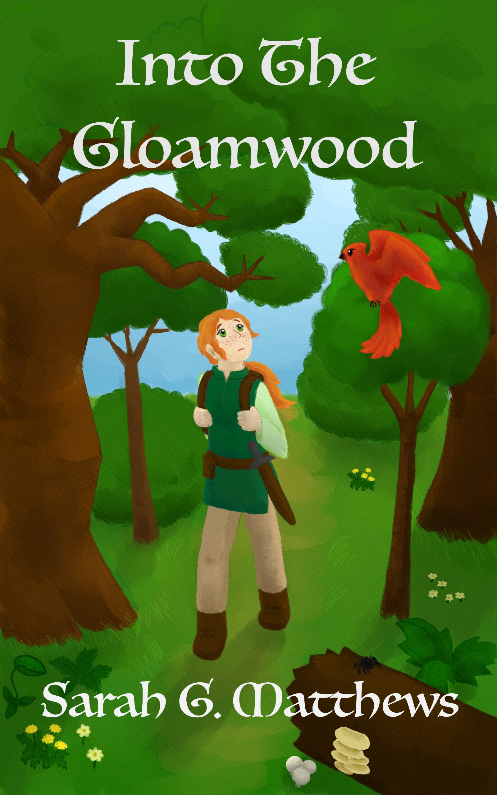
Notice the revisions and additions compared to the sketch. I restored some of the canopy near the top that my first sketch idea had had; it provided a consistent, dark background to contrast with the title text. I also added some younger trees, wildflowers, and a fallen log with a spider and mushrooms, to showcase a more realistic diversity of forest life. Trees at multiple stages of growth populate a forest, and some grow at a slant because the wind made them bow or lean! I hadn’t thought about that until my sister mentioned it and pointed it out in some photographs of woodlands.
For the illustration, I used my beloved plug-and-play Wacom tablet and a digital illustration program called Rebelle, which I’d gotten years ago during a sale for an absolute steal of a price. I love Rebelle. Users can buy the software once and keep it forever, and it excels at mimicking paints and other physical media.
It does not, however, offer easy ways to add text to an image, so I exported my art from Rebelle as a PNG, imported it into another art program called Krita (which is free), and tried out different Krita-supplied text fonts until I found one that I liked. I wanted an old-school classic fantasy vibe, and I think I got it. My dad agrees.
I was a smidge self-conscious about approaching the cover art this way because I know what the pros are capable of. Have you seen the cover for Travis Baldree’s Legends & Lattes, for example? Or perhaps the cover art for Naomi Novik’s Spinning Silver? Or The Enchanted Greenhouse by Sarah Beth Durst? It’s stunning. Lovely. Jaw-droppingly gorgeous. I wish I had that level of skill! Maybe I could build it up if I were a time lord.
But I liked that this cover art was mine, and I enjoyed the process of making it.
Publishing
I’ve described the writing process. I’ve discussed the illustration. That covers the artistry in this project. So let’s talk about publishing!
Why Self-Publishing (For Me)
The honest answer to “why self-publishing” is “because I tried the traditional route and kept getting rejected and thought my story would never exist publicly otherwise.”
I harbor no bitterness toward the agents who rejected me. It’s a tough business. They have to consider not only the quality of the writing but also whether they think they can sell it, and whether they’re excited enough about a project to champion it to publishers. Then a publisher has to invest upfront in it. Novels are a gamble—debut novels, particularly so. But I didn’t want this book’s existence to be limited by other folks’ willingness, or lack thereof, to take a financial risk on it.
Another key factor is that I could afford to self-publish. I’m financially secure via my day job and not relying on this for rent or grocery money. I could easily pay a hobby expense to do what I wanted, how I wanted, and not worry about needing an advance, critical acclaim, marketing, or any of the other stuff traditional publishing provides.
I wanted the satisfaction of making my book exist, a sense of control, and the chance to share my work with friends, family, and community, and I had the means to make it happen. So that’s why. Self-publishing suited my use case.
Options, Costs, and My Approach
Folks have a lot of options in terms of how and where they self-publish and how much they invest in it.
The lowest-cost option is zero dollars. An author can make their own cover or use a stock photo, select a single distribution platform with zero pay-to-play fees such as Lulu or Amazon, let that platform provide an ISBN and thus be the publisher on record (or in some cases, not use an ISBN at all!), and either provide the files oneself or use their built-in tools to help format everything. Ordering a physical proof—which will typically be a little under or over $10 for paperback, including shipping—is recommended if publishing in print, but it’s technically optional.
Or the author can opt to invest thousands of dollars. Pay a professional artist for cover art and a professional editor to help polish the manuscript, purchase ISBNs directly from Bowker (if in the U.S.), and pay for an expensive application like Vellum to format and decorate the book files. The artist and editor are typically recommended for those who want maximal polish and a more professional-seeming book, and who have the budget to invest upfront for it.
Or authors can do something inbetween. It’s a spectrum. An author’s happiest place on the spectrum depends on their priorities.
I opted for the lower end of the cost spectrum—no marketing, no specialized pricey software for formatting book files, no outsourcing for editing or artwork. I wanted to do this myself, to the best of my ability. While I could technically afford the premium options, I knew that would mean paying thousands of dollars I wouldn’t get back for services that wouldn’t make this any more fun or personally satisfying.
Here’s what I did spend money on:
- The ISBNs, to make myself the publisher of record: $295 for the 10-batch, or about $60 for the two I used
- About $40-$50 in proof and author copies, due to multi-platform exploration and late-game revisions; otherwise this could’ve been, like, $10-15 for one author copy
- A $25 change token on Draft2Digital, again due to late-game revisions, and to me approving my files too hastily
All software I used, I either already had or was able to access for free.
This totals close to $400 of expenses. If I do this again, I will likely spend just $10-20 to get myself a proof copy, plus a couple of my stockpiled ISBNs.
For writing, editing, and exporting my manuscript, I used Scrivener. It’s my favorite software for novel drafting. It includes options to compile projects into various formats, including print-ready PDFs for trade paperback and EPUB e-book files—though note, I had to edit and test the EPUB for accessibility with other tools.
I used a free application called Sigil, a lightweight code editor for EPUBs, to edit mine for accessibility. After I made edits, I used the free EPUBCheck tool to check for errors and the Ace by DAISY application to check for additional accessibility issues. I also did some manual spot-testing with VoiceOver and the Books app on my laptop, used Thorium for testing page navigation and a full listen-through, and put the EPUB in my Kindle library to check display and navigation on my Paperwhite e-reader and my cell phone.
I initially chose to distribute through Kindle Direct Publishing (KDP) for Amazon and Draft2Digital (D2D) for everywhere else: online storefronts like Apple, Kobo, Nook, Barnes & Noble, Bookshop.org, and platforms like Overdrive and Hoopla for libraries. Many indie authors take this approach: publish directly on Amazon and maybe one or two other big-name platforms for higher profit margins, and use an aggregator for everyone else to broaden their potential reach. Emphasis on potential. In my case, I wanted to provide as many options as possible to make it convenient for anyone to read my book, if they wanted to.
At the time, neither Amazon nor Draft2Digital had any upfront fees for publishing—except for the cost of a change token on D2D, because I approved my files and then decided to make last-minute adjustments. Draft2Digital has since declared their intent to start charging $12/year to maintain low-earning accounts, so I explored more options and added Lulu to my distributor list—but only for direct sales in the Lulu Bookstore.
All three distributors offer tools for auto-formatting both interior and paperback cover files, with varying degrees of hassle and customizability. I had already prepared the interior print PDF and the EPUB e-book files, so I popped those in as-is. Same with my cover art for the e-book and for the front portion of my paperback.
I did, however, use the distributors’ tools to generate the paperback wraparound covers—particularly, to add the spine and back blurb text and the ISBN barcode. This resulted in different fonts and slightly different sizing and layouts for the spine and back blurb text on Amazon versus everywhere else. I have since figured out how to handle the text for a wraparound cover myself, used that cover on Lulu and Amazon, and will likely update Draft2Digital around end of June, which is when I’ll get a free change token.
And then I scheduled my book for release, ordered myself an author copy, and told friends. My book exists now. And some of my friends and family got copies! Yay!
That’s my self-publishing process for Gloamwood in a nutshell. Several parts of it merit their own sections and further discussion.
About ISBNs
A note on the ISBNs and publication rights. Or several notes, rather.
Firstly: you don’t need an ISBN for your book at all, if all you want to do is print some personal copies to share with friends and family or sell an e-book (on some platforms). However, ISBNs are required to do business with libraries, brick-and-mortar bookstores, and numerous other print-on-demand services, such as Draft2Digital and Amazon.
An ISBN designates a specific book, edition, and format for industry and product identification purposes. A trade paperback is one ISBN. A hardcover requires a different ISBN. A paperback of a different width, or with large text and more pages, requires yet another ISBN. I published in two formats: paperback and EPUB e-book. E-books don’t need ISBNs on some platforms, but others require it, so I assigned one for mine.
The ISBN owner becomes the publisher on record and the presumed contact point for any bookstore owners or libraries who want the book. However—and this is important—the publisher should not gain your copyright. You retain the copyright even if a platform gives you a free ISBN. The free option is fine if you know you’re happy with using just that platform long-term—though, of course, you should still read all the fine print before publishing, to ensure they don’t make any predatory claims.
Also important: freely given ISBNs don’t transfer between platforms, and if several ISBNs are used for the same paperback, that may cause duplicate entries for a book in database records, which can lead to confusion as to whom to contact or who the publisher is. For anyone who wants to pursue self-publication as a professional side hustle, acquiring your own ISBNs is strongly recommended, both for publisher-on-record reasons and avoiding-confusion reasons. It’s also recommended for anyone who wants to sell through multiple distributors or switch freely.
You don’t have to, though, if you don’t want to and are okay with the tradeoffs.
The pricing of ISBNs in the U.S. is ridiculous, if you ask me. They have to be acquired from Bowkers. A single ISBN is $125, but the price drops drastically if you purchase in bulk. 2 ISBNs would have been $250; the 10-pack was $295. I’ve heard other countries are different, and some even give out ISBNs for free.
But I wanted to do the advisable thing, wanted flexibility in my platform and distributor selection, and would have been bothered by a) the duplicate entries and b) not being listed as my own publisher. I also have other novel drafts swaddled in my laptop’s hard drive that I could use the extras for in the future. So I got the 10-batch and considered it a long-term investment in my hobby. I could have gotten 100 ISBNs for $575, or 1000 for $1500, but I don’t imagine self-publishing 50 books in my lifetime, let alone 500. Batches that big are usually for small presses.
Paperback Formatting
This was, surprisingly, the more straightforward format to prepare.
Scrivener has a learning curve and takes a bit of fiddling around with, but if you know how to use it, it makes manuscript exports so convenient. I prepared my front and back matter in my project, selected my desired compile settings, exported to PDF for 6-inch by 9-inch trade paperback, and bam, I had my paperback interior.
I did encounter a few complications. Firstly: the map. I included a hand-drawn map before the main story, and it was initially off-center, more to the right of the print page. That wasn’t a Scrivener problem, though. I needed to shave some white space off the left side of the source image. Once I figured that out and re-added it to my Scrivener project, the export to PDF centered it nicely and made it slightly larger.
I also encountered an oddity with the appended glossary. Initially, I tried making it a list, format-wise, in Scrivener. When I did this, the PDF included an embedded font that Amazon wouldn’t accept. It was weird, and it took me a while to figure out what was going on. I still don’t know why trying to add a list had this effect on the PDF export. But as soon as I changed the glossary to simple paragraphs, well, it still looked like a list of words in print, and Amazon no longer complained.
The most complex piece for me, by far, was the paperback cover.
Paperback Cover
The paperback requires a cover with the correct dimensions to wrap around the front, spine, and back. Self-publishing platforms offer two approaches:
- Supply a print-ready PDF with dimensions that match their provided template and formatting requirements
- Use their in-house cover creators.
Initially, I chose option 2. I was having difficulty with the spine text in Krita; I couldn’t figure out how to rotate it. Option 2 seemed easier, and I wanted to meet my self-imposed deadline of end of March.
Draft2Digital had the most straightforward tooling. They autofitted my e-book cover to the front of the paperback, and they placed the text in suitable places on the spine and back when I typed it into the text fields. They offered less customizability than Amazon, but less hassle and a less buggy interface.
Amazon proved a nuisance, particularly for adding my dragon-cat icon to the spine. Here’s what I did:
- Downloaded their cover template file with necessary dimensions and loaded it in Krita
- Stretched my cover image to fit the front portion of the template
- Dyed the background layer the shade of green I wanted
- Placed my cute little dragon-cat icon low on the spine
- Exported as a JPG and used as the wraparound background image in Amazon’s cover creator
However, Amazon made the spine text larger than Draft2Digital did, which I liked.
Unfortunately, this meant that upon release, the spine and back blurb text font and sizing differed depending on where folks got the book from. I told myself this didn’t matter. The front cover, interior, background color, and text color were identical. My writing and art were the same, and my writing and art were what mattered.
But it bugged me.
So when I started setting up on Lulu, I decided, no, I am not having three different blurb fonts for my paperback from three different distributors. I will make this consistent.
Here’s what I did:
- Started with a cover file like I’d set up for Amazon—but I readjusted one edge of the cover image and the placement of my icon just a smidge
- In separate Krita files, typed out the text I wanted, in the font, color, and with the line breaks I wanted and in large size, and exported as PNG images with no background
- Back in my wraparound cover file (again in Krita), loaded the PNG images of the text, and shrunk, rotated, and manipulated them as desired
- Added the barcode and exported the whole thing as a PNG
- Tried converting to PDF and uploading to Lulu… but encountered dimensions complaints, even when resized to fit the template (I thought)
- Revisited Lulu’s cover creator, used a barcode-less and downsized version of my massive PNG, aligned and sized it to their template, and let them place the barcode.
- Repeated step 6 for Amazon and committed the cover change
The barcode placement doesn’t bug me. It might vary slightly, but both Lulu and Amazon placed it in the bottom corner of the back cover. I’m just happy that everything else in my cover design—everything I chose—is consistent.
Draft2Digital would require $25 to change now, but I’ll be alotted a free change token by end of June and will update my cover then. Lulu let me download their final cover PDF, complete with barcode (the only platform that did so), so I may be able to use that. Otherwise, I’ll follow the same procedure.
Next time, I’ll do all my layout and formatting in Krita from the beginning. This time around… well, if you acquire a paperback copy with a spine font that differs from the front cover font, I guess you have a distinctively early-print copy. Oops. Thank you for supporting me early!
E-Book Formatting & Accessibility
I thought the e-book would be the easy one. I thought Scrivener would format it perfectly for me, and all I would need to do is add alternative text for my map.
Ha. Ha. Ha.
For context, my e-book is an EPUB file, a standard file format compatible with numerous e-reader devices such as Kindle, Nook, and laptop and phone applications such as Libby. EPUBs comprise bundles of HTML documents and CSS stylesheets, similar to frontend website code. Code, unlike paper print, can make the text more accessible to folks with various kinds of disabilities. Can. If it’s written correctly.
Screen reader technology leverages certain tags and features in HTML markup to help their users navigate web pages. These features include header hierarchy, alternative text and descriptions for images (which is hidden from sighted users), informative titles in document headers, standard tags for images and interactive elements, et cetera.
If the EPUB text is reflowable, it can be resized and reshaped to fit various device screens. Users who can see but struggle with small text, or who have fine motor difficulties, can zoom in to make reading and interacting with links and buttons easier. Additionally, as long as the HTML doesn’t do anything weird or fancy (or is programmed carefully if it does), anyone should be able to traverse the EPUB via keyboard, without relying on a touchscreen or mouse.
Scrivener’s export provides an excellent starting point. The EPUB it generates is reflowable and works for me as-is for beta reading on my Kindle e-reader. Folks who don’t rely on screen readers or keyboard navigation wouldn’t notice anything off. But then I inspected my EPUB’s code with a free program called Sigil to add the alternative text, and I noticed that some details were, well, odd:
- Chapter documents starting with header level 2 instead of level 1; no level 1s anywhere in the EPUB
- Chapter names were split into multiple header levels, e.g., “Chapter One” was level 2 and “Bathilda’s Request” was level 3
- Why was my cover image a SVG instead of an IMG?
- “em” and “strong” tags used everywhere versus “b” and “i” (which, it turns out, have a different semantic meaning for screen readers despite having the same visual presentation)
I researched the EPUB format, accessibility guidelines, and how to use a screen reader. WCAG 2.2 defines accessibility standards from levels A to AAA. AA is typically the level to target. EPUB Accessibility 1.1 from W3C provides information and suggestions for implementing this standard in EPUB documents. The standards and other accessibility-related articles indicated I should also:
- Add accessibility-related metadata, and some other metadata, to the OPF file
- Not rely on capitalization alone to indicate vocal emphasis (hence, use “em” tags or the like in conjunction)
I learned, at a rudimentary level, how to use VoiceOver on my Mac. The first thing I learned was how to easily toggle it on and off (Command + F5), so I wasn’t afraid of getting stuck with it and could try it out and quit if I got frustrated. Then I tried using it on my e-book with the Books and Calibre apps. This identified a few other issues:
- Extraneous line breaks (“br” tags) used purely for visual spacing; better to use CSS padding so the screen reader doesn’t read them aloud. (I only noticed that reader behavior in Calibre; Books seemed to hide them.)
- Repeated underscores (“_”) being read verbatim; changed manuscript to use ellipses (“…”) which are gracefully skipped over
- Probably other stuff I forget now? Oh my goodness. I adjusted so much code.
I examined a couple of traditionally published EPUBs as well to see how they did things, and noticed one offered page breaks and a page navigation list that corresponded to the print copy. I remembered one of my friends once told me that a pain point for screen reader users is the inability to quickly skim and jump around text. Including page breaks and page navigation mitigates that issue, and in academia, this feature helps with discussing and citing specific page numbers. How many times has a teacher told you to flip to page 284, or 111, or whatever number? Think about it.
This page navigation was in the “nav” file—a navigation file used by e-readers to support navigation menus, but not typically included in the main reading flow or the “spine” of an EPUB. If a “nav” file is not present, e-readers can use the table of contents file, as long as it includes a “nav” element. My EPUB had the table of contents in a nav element, but not a separate nav file. I changed this when adding the page breaks and page navigation.
Another EPUB had a mini table of contents at the beginning that linked to a more detailed table of contents at the end, keeping the longer content list out of the way to avoid spoilers but still within the EPUB’s spine for ease of access. I liked that, too, and implemented a similar mini-table in my own e-book.
I also used a couple of automated tools to help me catch bugs:
- EPUBCheck tool by W3C, which detects code errors like broken links
- Ace, the accessibility checker for EPUB by DAISY, which autodetects certain accessibility issues
Neither of these are a substitute for manual evaluation, of course, but I found them quite useful.
I also had the chance to discuss accessibility with a friend who knows more about the subject—questions like, is it better to have thorough alternative text in this case to capture the flavor and color instead of worrying about brevity (yes); what to do about the annoying-sounding underscores (ellipses); what to do about my made-up fantasy words, if anything (the glossary); what screen reader funkiness I should and should not worry about; et cetera. She pointed me to a resource listing ideas for accessibility test environments, which in turn helped me find the Thorium reader application.
As mentioned, I used the Thorium reader in my final-hour listening and editing pass. I also used it to verify functional page navigation, which only some e-readers support. It also, unlike many readers, has built-in support to tweak line, paragraph, word, and letter spacing, which some users need to easily read text.
They say you don’t need a software engineer to self-publish e-books. This is true. You don’t have to go into the guts of the EPUB code like I did. You don’t have to go this hard.
But I’ll be damned if I shut out any of my friends from my stories when I know I can do better. And for this, my programming background came in clutch. I even coded up a couple Python scripts to generate the page breaks and navigation lists and save myself some tedium! (Though other aspects of the tedium were unavoidable.) I also tweaked a few aspects of the visual presentation, such as spacing in certain places.
So. After all of that, and after my final listen-through and tweaking pass, I uploaded my edited e-pub and hit Publish.
A couple weeks after the initial publication, when I started looking at Lulu, I found they had a checkbox to indicate whether an EPUB complies fully with WCAG 2 AA standards and European Union accessibility requirements. I thought mine did but wasn’t entirely confident. Fortunately, Lulu had links to numerous resources, including several I had already used and a crucial one I hadn’t: Ace SMART by the DAISY consortium, which is a checklist, database, and report generator for manual testing of accessibility. I worked through the checklist, fixed a small detail in my metadata, updated my e-book files, and finally felt like I could in good faith check that full compliance box.
I did the best I could with the tools I had available. I believe I did a good job. I am not, however, a certified evaluator, and I am human and prone to error. So if anyone does notice an accessibility issue that I somehow missed, I hope they assume good intentions and reach out. I included a note to please do so on my website page for Gloamwood.
Now that I know what to look for and what tools I can and want to use, I should be able to check and edit future EPUBs far more efficiently, perhaps with a procedure like this next time:
- After all my beta reading and revisions, listen through with Thorium and apply all final wording and punctuation tweaks to the text before editing any EPUB code. Export and finalize my print-file interior.
- Create the nav file, edit the OPF metadata, and edit any other clear issues in the EPUB based on my current knowledge (extraneous HTML line breaks, headers, etc.)
- Add my page navigation list and page breaks. (I regretted doing this before my final listen-through so much. So much, you guys. I had to move a bunch of the page breaks because of tiny manuscript adjustments that shifted page endings by a line or two!)
- Run through the EPUBCheck and Ace by DAISY auto-checker tools. Fix any issues.
- Manually check navigation and display with VoiceOver and Books, Thorium, my Kindle’s e-ink display, and with my phone.
- Go through the Ace SMART checklist.
- One more pass through EPUBCheck and Ace by DAISY to sanity check any edits.
- Declare my e-book publication ready and upload it to my distributors of choice.
Aside from all this editing, I also made one other key choice for accessibility and convenience: I released my e-book without digital rights management (or DRM) software applied. Regardless of where you purchase it from, you should be able to download the EPUB file and load it in whatever application works for you: Nook, Kindle, Apple Books, your laptop, your phone, et cetera.
If you’ve read this far, kudos. Genuinely. This blog post is getting rather long, isn’t it?
Distribution Options
Right, so, distribution! We’re almost done with my post, I swear. I think. No, actually, I lie.
Most indie authors rely on distributors that use print-on-demand (or POD) services. These include Amazon KDP, Draft2Digital, IngramSpark, Lulu, Barnes & Noble, et cetera. Some of these distributors are also, or primarily, endpoint sellers (retailers, in other words, or “direct” distributors). Amazon KDP, for example, makes the book directly available on Amazon, and Lulu can sell a book on Lulu Bookstore.
Indie authors have other options that involve a touch of upfront investment and gamble. An author can order copies from a printing service—I can do this from any of my current distributors at cost of printing and shipping, actually—and either try to sell the books directly, or enter a consignment arrangement with a local bookstore. Selling on consigment means providing the physical copies up front and getting paid by the bookstore if and only if they sell. If they don’t sell, the author might have to take the unsold copies back, depending on the bookstore’s policy.
Personally, I’d consider a consignment arrangement for a very small number of books, like one to five max, out of curiosity and as a way to interact with fellow book-lovers. But I’m not inclined toward high-commitment or high-risk arrangements. It’s a legitimate strategy, but a demanding and risky one. Print-on-demand through a distributor is easier.
Economics: Retailers vs Aggregators
There are two main types of print-on-demand distributors: direct distributors and aggregators.
Direct distributors are platforms that list an author’s book on their own retail site and sell it directly there. Lulu Bookstore is one example; Amazon KDP is another. Direct distributor reach is confined to traffic on their own retail site. However, when the distributor is also the retailer, this means fewer entities laying claim to pieces of the profit, which means higher percentages of revenue go to the indie author. (Hi. That’s me.) For physical copies, print price is typically subtracted from the list price. For e-book, a small file transfer fee might be subtracted. Then the distributor and the author each take a percentage of what’s left over. The author ought to receive more of the revenue than the distributor. But check the platform’s policy and do the math.
An aggregator, or wide distribution service, is different. They handle the print-on-demand and order fulfillment, but they don’t sell your book directly. Instead, they get your book listed on other platforms and make it available for bookstores and libraries. In theory.
In actuality, bookstores don’t like to order from aggregators unless they offer returns, and even if returns are offered, they won’t order unless they perceive an audience for the book that they can sell to. Libraries might buy a copy if enough readers ask for one, though! And maybe a bookstore would order a copy or two if their customers ask. I’m not sure. Either way, I didn’t prioritize getting my book on physical shelves.
Draft2Digital and IngramSpark are both aggregators. Draft2Digital gets my book listed online on Barnes & Noble, Bookshop.org, Apple Books, Kobo, and others—including platforms libraries like to use, such as OverDrive and Hoopla.
An aggregator saves an author considerable hassle in getting their book listed widely. I don’t even know of a way to make my book available to libraries without using an aggregator! The tradeoff, though, is that both the aggregator and the endpoint seller take a cut of the profit, which means the author has to set a higher base list price to account for both printing costs and middleman shares and still makes less. I’m still very happy if a reader decides to buy my book from Bookshop.org. Hooray for supporting independent bookstores! However, I get less for a purchase made there… or at Barnes and Noble… or any other such retailer that I didn’t set up with directly. The difference is starker with print; it matters less for e-book.
Seriously, please don’t worry or feel bad if you chose one of those options that nets me less. I wouldn’t have made them available if I didn’t want people to use them, and they still are giving me something. My top priority was making my novel easy to acquire, and this way, if your favorite online storefront is having a sale, you can take advantage of it. (Note: if a retailer has a sale, it doesn’t impact how much I get! It impacts the retailer’s share.) But from a pure profit-margin perspective, the most tactical choice, for me, would’ve been to make everyone go through Lulu for print and Smashwords for e-book—though Lulu is a close second for e-book too, and Amazon third for e-book and close-ish second for print.
So I’m compromising and listing Lulu first and prominently alongside other options on my site now, and I’m giving you this information. 😉
Economics: Print vs E-books
If you’ve read this far (goodness, good for you), you’ve almost definitely noticed that my ebook is priced at less than half of my print book.
Print has a physical material cost, and that cost is subtracted from the list price when the book is bought. Cost is based on the page count, black-and-white versus color, and my paper selection. Fewer pages? Lower price floor. More pages? More expensive. Even the cheapest option, Amazon, has a printing cost of about $4.80 per copy for my 317-page paperback. Then, of course, paperbacks cost to ship, usually $5-6 for standard media mail via USPS. Shipping doesn’t factor into the list price, since it’s added on at checkout, but I do need to account for it if I’m ordering author copies. It’s marginally more efficient to batch-order a few at once due to shipping.
Physical books simply involve more materials and logistics for both production and transport. They’re more expensive and time-consuming to produce and distribute. That’s probably why distributors take a higher percentage of the profit margin—and that’s part of why my print copies are more expensive. I picked a price that seemed roughly in-line with market for fantasy paperback, on the affordable side but still high enough to let me make a little per sale, even through my most indirect channels.
E-books, on the other hand, require no physical materials and have no base printing cost. They can incur a file transfer cost, but barely. It’s pennies, not dollars. The gross profit margin is close to the price of the e-book. On some distributors, their base price can literally be $0. Free. The limit is the floor—or close to it. Others require a $.99 minimum to cover file hosting and transfer.
I didn’t want to signal a belief that my book is worth nothing in a world where dollar signs are used to signify value, especially after all the effort I put into it, so I listed it for a non-zero price that seemed both reasonable for the indie fantasy e-book market and affordable.
I also recognize that convenience plays more of a role in e-book vendor selection, since e-reader platforms have convenient integrations for books purchased through their own storefronts. Any e-book purchased through Amazon is immediately added to the Kindle library, for example. Even without DRM, I get it if you want to skip the hassle and take advantage of that platform integration for e-books. With print, you’ll have to wait for the book to ship and arrive at your doorstep regardless, so it matters less.
My Distributor Choices
That concludes my overview of general distribution options and economic considerations. Now I’ll touch on the distributors I chose to work with.
Amazon KDP
Oh, Amazon.
Amazon has faced criticism for unethical treatment of workers, environmental impact with difficult-to-recycle packaging, and tax evasion. (See “Criticism of Amazon” on Wikipedia as a starting point.) However, the company has one of the largest book markets, convenient and efficient tools, and cheap printing costs and zero upfront fees that let authors in turn make their books more affordable for readers. Practically speaking, they’re difficult to ignore.
…and despite my concerns regarding their business practices, I’ll admit, I’ve found Amazon incredibly convenient on a number of occasions, including one in which I urgently needed something shipped to me. I like the Kindle Paperwhite I have, too; it works nicely and has the exact kind of display I need for insomnia-o-clock reading.
Amazon also doesn’t play well with third-party aggregators, so it’s hard to tap into their market unless authors directly set up with them—at least, from my reading. It sounds like listings from third parties tend to get shown as out of stock and take longer to ship. Draft2Digital doesn’t even get people listed on Amazon at all, except by invitation.
So I set up on Kindle Direct Publishing (KDP) for Amazon sales. It was mostly easy, paperback cover creation aside, and I knew some of my readers would appreciate having the option. Caveat, they do require sensitive data for tax withholding purposes, including ID. This was implemented within the past couple of years, I believe, and I believe they’re not the only place that requires this.
Overall, I’ve found their print quality to be quite good for the price. The interior text is very clear and stands out on the page. The cover is clear as well, with more light/dark contrast than Draft2Digital but less saturated colors. Mainly I noticed that Corrin’s face was paler, as was the sky behind her, and some details in her hair stood out more. My mom was happy with the copy she got through them, and a friend seemed to be as well. My copies had, surprisingly, a fairly substantial thickness and paper weight. Amazon documents that the paper weight used can vary, however, depending on location.
They do plaster “Not For Resale” across their physical proof copies, which is annoying. The proof also had a section of top edge that was just white, like perhaps it was misaligned. Seemed like a one-off printing error; a friend said he’s seen those with some of his proofs, too.
The author copy I purchased didn’t have that, though it seems less… flat? Less perfectly pressed? Perhaps it was impacted by transit in a bubble-wrap envelope. Those don’t offer as much protection against bending as a cardboard box. It’s not falling apart or anything, though. I think slotting it neatly into my bookshelf has been good for it, too. It was also very affordable. Here it is:


Don’t mind the kitchenware in the background. This is an early printed copy. You can see the large and bold-looking font that I’d picked from the Amazon cover-maker for the spine and back blurb. As I said, quality doesn’t seem bad for the price.
KDP can function as an aggregator for paperbacks as well via their expanded distribution. This has zero upfront expense, though it requires (as with other platforms) that the author accept a smaller royalty payment through the expanded channels—40% of revenue instead of 60%, and that’s after subtracting the printing cost and third parties’ cuts! And it’s only offered for paperback, not e-book. Between the paperback-only limitation and concerns about Amazon’s ethics, I didn’t want to rely on them for wide distribution.
I do understand why so many indie authors use Amazon exclusively or use their expanded distribution. It’s simple to set up. It has no financial barrier to entry. Using them as a direct distributor yields higher profit margins for lower cost than going wide, and tons of readers shop there. Likewise, zero shade to readers who use Amazon. So do I! It’s highly convenient. I can’t throw rocks while I’m standing in a glass house. And if you got my book through Amazon, hey, you got me a relatively high chunk of the revenue since I set up on KDP directly.
That’s Amazon. Questionable business ethics, but an affordable, convenient, zero-cost-barrier option for self-publishing.
Draft2Digital
I selected Draft2Digital for wide distribution because I heard they have a more user-friendly interface than IngramSpark, and they had zero upfront costs for publishing at the time. The tradeoff was that Draft2Digital has less customizability for print and no return-and-refund option for wholesalers, but for my use case, this was fine.
They made setting up my e-book and paperback incredibly convenient, automatically duplicating certain metadata between them for me. Their site has clear documentation regarding their policies and helpful information for publishing basics. They also provide universal book links (UBLs) through Books2Read. My UBL doesn’t list all the vendors who stock my book, but it lists links for many of them, so I’m using it alongside other, more direct links on my site for some major ones.
When I approved my book for preorder, Draft2Digital got my book listed all over the place fast. I had e-mail notifications from Draft2Digital within the first couple of days, showing multiple checked-off vendors. The last holdout (Hoopla) was listed within a couple weeks. Like Amazon, D2D required me to fill out a form with personal information for tax withholding prior to publishing, but I don’t recall them requesting ID.
Having wide e-book distribution in particular, and so easily, is fantastic. I use a Kindle, but my dad has a Nook, and someone else I know uses Apple Books. I wanted to make reading my novel as convenient as possible for them! And since Draft2Digital owns Smashwords, I get an extra-high percentage if anyone buys my e-book from there.
I was content with Draft2Digital’s print quality as well. They go through IngramSpark. I liked the light/dark contrast in Amazon’s print covers, but I think, for this project, I preferred the vivid, saturated colors from Draft2Digital. Their cover also felt pleasant to the touch. It was… not velvety, exactly? Nonetheless, it’s nice, albeit different from many of the traditional paperbacks on my shelf. Here’s an author copy from them:


Again: nice overall, and neatly compact. The colors look richer and more smoothly blended on the cover. The margins around the blurb text supplied by the cover creator were… hm… a little narrow, but no complaints otherwise. They are slimmer than my copies from Amazon, with a narrower spine; I suspect they use a lighter-weight paper. The slim profile makes them a smidge easier to fit on a bookshelf but a smidge harder to notice. Printing cost is about a dollar higher than Amazon per copy, as is shipping, which works out to paying a couple bucks more overall to get an author’s copy.
I liked that they used cardboard packaging to ship the books, even the single-copy orders. The cardboard packaging is firmer and more protective than a bubble-wrap envelope, and it’s easier to recycle. All copies Draft2Digital has sent me have been neatly pressed, with no funky white edges in the proof or in the author’s copies I ordered.
I also like that Draft2Digital’s proof copy didn’t have the annoying “Not For Resale” bar plastered across the front, so if I had done the final polishing past before setting up, my proof would have been a great memento copy. Or a copy I could resell, theoretically.
However, in a batch of six author’s copies, two books did arrive with a dented corner—likely from being tightly packed in or mishandled during delivery or unpacking. They were packed in stacks of three next to each other and might’ve been too crammed in horizontally.

Again: likely a packing, shipping, or unpacking issue, not a printing issue, but I need to figure out what to do with those two copies now. Maybe offer for a discounted price? That seems fair. Perhaps I can ask the kindly person who expressed interest in the batch and see what she thinks.
Overall, Draft2Digital has its pros and cons. I was displeased with those couple that had corner dents, and I haven’t decided whether I prefer Amazon’s thicker spine and paper or Draft2Digital’s slimmer print profile. But I preferred Draft2Digital’s cover texture and color saturation, as well as their packaging for single-copy orders, and I don’t know how consistent Amazon is. (Documentation says their paper weight varies.)
Note that unlike Amazon and Lulu, Draft2Digital charges $25 per update to paperbacks—only to paperbacks, no charge for e-books—once the files are approved, unless you wait long enough (three months after release) to earn a free change token. This is because their printing goes through IngramSpark, which always charges $25 for physical book changes. I got bit by this fee because I rushed to approve my files. But it is avoidable.
Now. About that “no upfront costs at the time” comment.
A couple of weeks after Into the Gloamwood‘s release, Draft2Digital announced that they will introduce account activation and maintenance fees to deter “automated and low-quality account creation” and associations of indie authors with “low quality ‘slop’.” The one-time activation fee for a new account is $20, and the maintenance fee is $12 per year, applied only to accounts that earn less than $100 in net royalties in the past year. Fee date is based on the account’s anniversary.
They didn’t say AI, but I suspect generative AI spam is a contributor to their reasoning for this. Ugh.
I was quite displeased when I first heard this. The new account fee doesn’t affect me, but the maintenance fee will almost certainly apply to me. I’m a hobbyist author paying zero dollars for marketing because I’m allergic to it and don’t consider it fun. I resent and ignore advertisements, myself, when I stumble across them in media or on the Internet. I’m literally just relying on word of mouth and telling family and friends about my book.
How the notification e-mail was worded also felt sucky. Authors might not earn $100 because they’re writing for a niche audience, or they might have published a passion project with care and polish but zero marketing, or they might have made their stories as low-priced and affordable as possible (or free!) for a community. Their stories aren’t slop.
Then I complained to my mom about the account maintenance fee, and she pointed out that that’s… $1 per month. That is a fraction of a latte per month. That is one very fancy latte per year. Maybe a cheap latte and a bagel.
That’s not much.
I recognize, of course, that this sucks for authors who are pinching every penny out of necessity. The fees are, however, drastically less than what I paid for my ISBNs. It’s also less than what I pay for my website hosting. (I pay the equivalent of a cheap latte per month for website hosting.) It is, frankly, a minuscule hobby expense for keeping my books widely accessible via an easy-to-use platform.
I was leaning toward jumping ship from Draft2Digital come October, but perhaps I’ll stay. They are, at least, being transparent about the fees, including giving accounts advance notice and the ability to opt out by unpublishing all of one’s books. IngramSpark’s fees are one-time per book, but steeper, and they don’t give any free change tokens for post-publication fixes. Right now, D2D still looks like my best option for wide distribution.
Lulu
Initially, I looked into Lulu as a possible alternative to Draft2Digital. So far, I like Lulu—but as a direct-to-retail option and an alternative to KDP, not for going wide.
I’d heard of Lulu in passing but not considered the platform because they weren’t mentioned as much as Draft2Digital, Amazon, and IngramSpark. I’d gotten the impression they were more geared toward niche projects and unusual printing options. And, well, they kind of are. They have ample options for bindings, sizes, and covers: the standard perfect bound paperback, color print, multiple hard cover options, and options like saddle-stitch and spiral-bound for projects like planners and magazines. They also have the option to keep your project private and simply order prints for yourself.
Their business model makes money on printing, I believe. I’d heard that Lulu offers high-quality printing. It’s also about twice as expensive as my other distributors, over $9 for my 317-page paperback instead of $4-6.
Gee, I sure hope it’s good, right?


It’s akin to what Draft2Digital sent me. Similar thickness, color richness, and cover texture. Do Lulu and Draft2Digital (and by extension IngramSpark) use the same printers? I expected the copy from Lulu to be thicker, because supposedly Lulu uses 60# paper instead of 50#, but no, they’re nearly identical. If Lulu has superior quality, it’s too subtle for me to discern. I am neither delighted nor displeased, in truth. This means whether someone orders from Lulu or anyplace D2D distributes to, like Bookshop.org, the print quality and physical feel and dimensions of the book should be quite similar.
You can see that this copy has my up-to-date cover; the spine font matches the front cover font. The back blurb text has a font more like what I used with Draft2Digital, but with more margin around it like the Amazon copy. I might have gotten overenthusiastic with sizing up the spine text—perhaps, if I tweaked it again, I’d size it back down just a smidge to make more space between title and author name—but you know what, it’s fine, visually prominent and stylistically fitting, and I shall not fiddle with it anymore.
Lulu nicely packaged my author’s copy in a protective cardboard box, similar to what Draft2Digital provided. Like Amazon (and Draft2Digital initially), it costs nothing to set up on Lulu, and nothing to start distributing directly through them.
They are also the only platform, out of all three, that let me download my generated cover files. Additionally, they have numerous resources and links to information and tools for publishing, some from third parties and some from Lulu themselves. I will note that at a glance, many of Lulu’s resources look like they exist to uptalk Lulu. I appreciated the guidance their site provided for assessing e-book accessibility, though. They didn’t require tax information, either, although they would if I opted to distribute wide through them.
Lulu takes the smallest percentage cut I’ve seen from order revenue: 20%, leaving the author (me) with 80% of the revenue. They also only take 10% from e-book revenue after a file transfer deduction (99 cents) from the list price, which works out to be almost as good, but not quite, as Smashwords on Draft2Digital. For comparison, Amazon takes 40% revenue for paperbacks and 30% for Kindle e-book.
Overall, Lulu wins out economically above a certain price threshold for direct distribution, as it does for my paperback—presuming you can point your intended audience there. However, their higher base printing costs do set stricter lower bounds on book prices, so if someone wants to price their paperbacks as low as possible and still break even or earn revenue, Amazon KDP wins. Additionally, if you want author copies with similar print quality and protective packaging for a lower cost, I’d recommend just ordering from Draft2Digital, if you set up with them. (Or you can use Amazon if you’re not fussed about the bubble-wrap envelopes and slight difference in thickness and texture.)
Interestingly, Lulu offers APIs that enable authors to bypass the bookstore commission entirely, sell print copies direct, and only pay Lulu’s printing and shipping costs. I could integrate those APIs with WooCommerce on my WordPress site, take responsibility for maintaining that infrastructure… be on the hook for customer service… on top of working my full-time day job, training a martial art four times per week, squeezing creative writing and drawing into my life somehow…
Eh. No thanks. Lulu Bookstore can keep the 20% revenue commission.
For folks who either just want to make print copies for themselves or want to sell their book to people they know or an established audience, I think going direct with Lulu is a fine option.
Lulu can also function as an aggregator and distribute wide for both e-book and print. However, their documentation says it takes up to 12 weeks for books to be listed by retailers and library platforms, as opposed to listing within days or a couple weeks like Draft2Digital did.
They charge a one-time $5 review fee per book (and e-book and paperback count as separate), and for print books, they require the author to order a proof copy before approval. The fee is minuscule, but between that and the required physical proof ordering, Lulu would cost more than Draft2Digital for more prolific authors.
Additionally, the list price has to be at least twice the cost of printing for the author to break even, due to the percent discount they give wholesalers. With their high base printing cost, that would require my paperback to list at about $20 or higher… which is on par with most of the traditionally published paperbacks I see on Barnes & Noble, but higher than my current price, and would still barely exceed breaking even. A hardcover would have to be priced over $30 wide, minimum, and $45+ for the nice linen with dust jacket. The print cost isn’t so terrible for selling direct, but it bites for going wide.
In terms of time, convenience, and cost efficiency, Draft2Digital has distinct advantages over Lulu for wide distribution, despite the new fees D2D is imposing.
Summary
Okay, here’s the Cliffnotes version of all that blather.
All three platforms I selected offer the following:
- Either small-to-moderate cost barrier, or zero cost
- Have a wide distribution option
- Offer free ISBNs tied to them, or let you use your own
- Offer free tools to help with paperback cover creation—and print interior and e-book formatting, though I didn’t use those
- Can order author copies at print price and shipping
Amazon KDP: an affordable option with a wide market
- Print cost and quality: cheapest and generally good
- Zero cost barrier to publishing
- Difficult-to-recycle bubble envelope packaging for single-copy orders, and other ethical concerns
- Selling directly on platform: high-ish percent revenue to author (60% after printing)
- Distributing wide: no cost barrier, although authors earn less per sale on expanded distribution channels, as is typical with aggregators. Only available for paperback.
- Huge market; many readers shop on Amazon because they’re so convenient
Draft2Digital: most convenient for wide distribution; I like them, especially for e-books, but with caveats
- Print cost and quality: not quite as cheap, good quality
- Originally zero upfront cost (assuming you don’t goof and need a change token), but introducing $12 maintenance fee for low-earning accounts and $20 activation fee for new accounts
- Packaging is protective and easy-to-recycle cardboard, even for single copies
- Easiest-to-use and convenient book setup tools
- Primarily an aggregator, no direct distributor option for print, but owns Smashwords for e-books
- Gets book listed widely fast, and can do so for both e-book and paperback (e-book fastest)
- High % e-book list price earnings, especially on Smashwords; less high for paperback
Lulu: the one I discovered late; I like them for direct distribution
- Print cost and quality: most expensive, similar quality to Draft2Digital
- Selling directly on platform: zero cost barrier and no ISBN assignment required. High percentage of revenue to author. If author uses the APIs on their own website, even higher!
- Distributing wide: not so good. One-time $5 review & approval fee per book, 12 weeks delay in listing. High price floor due to high print cost and wholesalers’ cut.
- Tons of articles, links, and pointers to resources to support authors (though some are biased to promote Lulu). Accessibility resources particularly appreciated.
- Wide variety of print options, including multiple options for hardcover
- Far less traffic on Lulu Bookstore, so a book won’t simply be found by readers, but it’s hard to get noticed in a sea of books regardless.
Many folks would find setting up on three separate platforms overkill. Most indie authors, I presume, limit themselves to one or two. But I wanted to research and experiment.
Besides, now that they are set up, they serve different purposes and maximize options for readers—and for me. KDP for Kindle and higher royalties on Amazon. Draft2Digital for all other e-book platforms, libraries, and other major retailers that may offer sales or see different traffic. And Lulu for highest earnings per paperback, and for anyone who has qualms about Amazon but wants to maximize how much of their money goes to the author, i.e. me. (A couple of friends have expressed this desire, which is very sweet and kind.) I should also be able to set up future books more efficiently, with my accounts established and procedures learned.
Anyway. This is what I liked and didn’t like about the distributor options I explored for Into the Gloamwood. Every author needs to weigh their priorities and crunch the numbers for themselves. Another author’s needs and preferences may differ drastically from mine.
On Publishing: Closing Thoughts
Publishing turned into quite the research project, with requisite minor expenses for my adventures and mistakes. I’ve learned extensively about the logistics of self-publishing. Distribution strategies. Platform options. Considerations for print versus e-book. E-book accessibility, structure, and code. What to prepare and in what order to publish more efficiently and seamlessly. POD service variance. My personal preferences.
I discussed economics extensively here, because it was new and complicated and interesting to learn about, but I want to reiterate: I’m not fussed about maximizing profit. Sure, it would be nice to make some of my hobby expenses back. I would prefer to. But I’m well off through other means, and what I want first and foremost is for folks to read and enjoy my stories. Please shop wherever works best for you—and if you read my novel, yell about it, or support it in any other way, thank you so much!
Reception & Reflection
It’s been just under a month. I have done no marketing. I have relied entirely upon word of mouth; that is, I told some family and friends and posted on BlueSky and Facebook. I wasn’t even that loud about it. I have sold, in total, just under twenty copies. This book, while widely available, has not found a large audience. This is in line with my expectations, given how I approached it and how stiff competition is for attention in the publishing marketplace.
However, the enthusiasm and encouragement I received from several people I knew, and who I received it from, far exceeded my expectations.
Family members I never expected to enjoy my writing said I was a “really good writer” and hoped that the book would circulate more widely. One of my favorite past professors told me he “love[d] the cover” and bought a copy. A couple friends in a virtual writing group I attend were enthusiastically supportive, too, even though I’ve never met them outside the confines of our online group. One even asked for a signed copy! (And she’s got it, I mailed it to her! For list price plus shipping, I can swing that for friends and family if they don’t mind waiting a smidge longer for the book to arrive.)
My chief instructor at my aikido dojo told me she was so proud of me and that my cover art was “gorgeous,” and and she bought a copy of my book on Kindle. Another chief instructor, whom I’ve only ever interacted with at seminars, reached out via Facebook and asked if she could sell copies for me at her dojo, all because she believes so strongly in supporting people who dream. (That’s why I ordered the small batch: one for the signed copy plus five for this kind sensei. I still need to get them to her; I will when we both attend a seminar in a month!) Yet another kind soul at my home dojo volunteered to make and post flyers the instant she heard I’d published a novel. She was so excited at the prospect of helping me find an audience. She said, emphatically, “You wrote a book! You should tell people about it!!” As if it were this tremendous feat, an achievement I should shout to the universe about.
Perhaps it is. Perhaps completing a novel is an incredible thing. I’m not a shouter by nature—I feel a bit shy about announcing my book to people, worried I’ll push it to an obnoxious extent or at inappropriate times—but it is pretty cool.
That isn’t even touching on all the beta reading and encouragement I received from family and friends during the actual writing and editing of the book.
It was neat to get to share my writing and artwork with family and friends. How wonderful, how lovely, to discover that I have more support than I’d imagined. Publishing my novel was worth doing for that alone.
If you’d like to support my passion project too, by all means, consider getting a copy of Into the Gloamwood, leaving a review if you like it, and telling friends. But please, no pressure, and no obligation. Thank you very much for reading to the end of this post. =)
Resources
Here is an extensive, but non-exhaustive, compilation of resources I used. They are divided into ebook accessibility specifically and self-publishing more broadly.
Ebook Accessibility
Ace SMART by the DAISY consortium
“App reading system” – the DAISY consortium (for testing environments)
EPUB Accessibility 1.1 from W3C
“Learn More About Accessible Ebooks” by Lulu
Web Content Accessibility Guidelines (WCAG) 2.2
Other Self-Publishing Resources
“Anatomy of an EPUB File” – EDRLab
Leave a Reply